
 EN
EN



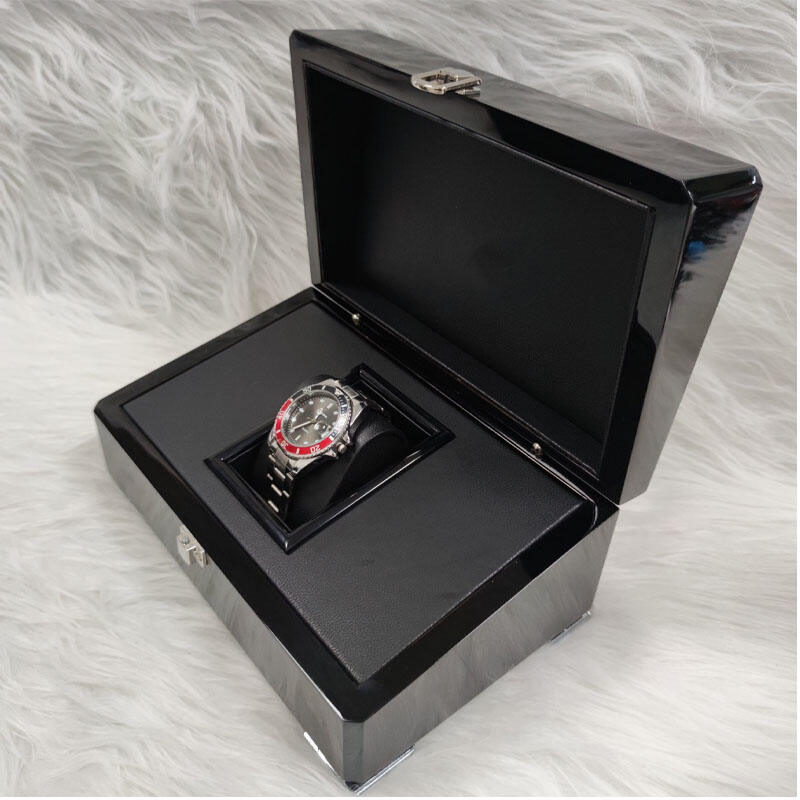
When it comes to presenting fine jewelry, the packaging is never an afterthought. The Cartier box has long been recognized as one of the most iconic examples of luxury packaging in the world. Its distinctive design, premium materials, and meticulous construction set a benchmark that the entire high-end jewelry industry looks to for inspiration. Understanding what makes this style so effective reveals important principles about how packaging elevates perceived value and reinforces brand prestige.
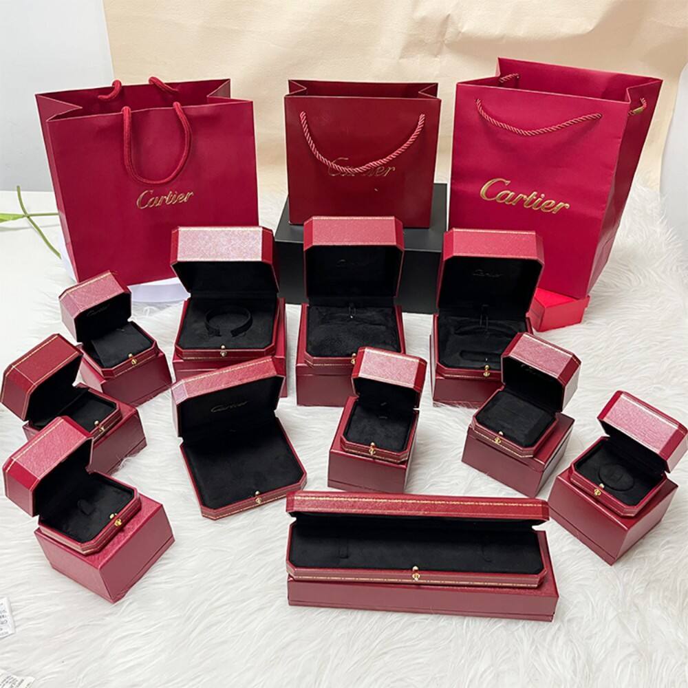
The Cartier box is not simply a container — it is a carefully engineered experience. From the moment a recipient sees the signature red exterior to the instant they lift the lid and feel the resistance of a perfectly fitted hinge, every detail communicates quality, exclusivity, and care. For jewelers, luxury brands, and packaging professionals, studying the features that define this style offers a masterclass in what high-end jewelry packaging must achieve to truly complement the pieces it holds.
The Role of Signature Color and Visual Identity
How a Consistent Color Palette Builds Instant Recognition
One of the most immediately recognizable features of the Cartier box is its deep, rich red color. This specific shade — often described as a warm, confident crimson — has become so closely associated with the brand that it functions almost as a logo in its own right. When a customer sees that red box across a room, recognition is instant and emotional. This is the power of a committed, consistent color identity applied to packaging.
For high-end jewelry packaging, color is not decorative — it is strategic. The Cartier box demonstrates that choosing a signature color and applying it with absolute consistency across every product tier, from rings to necklaces to watches, creates a unified visual language. This consistency reinforces trust and signals that every item within the collection belongs to the same world of quality and craftsmanship.
The matte or subtly textured finish on the exterior of the Cartier box also plays a critical role. Rather than a glossy, reflective surface, the restrained finish communicates sophistication. It absorbs light rather than competing with it, allowing the jewelry inside to remain the true focal point. This deliberate restraint is a hallmark of luxury design thinking.
Typography and Branding Placement on the Cartier Box
The placement of the brand name on the Cartier box is minimal and precise. Gold or cream lettering, applied with clean spacing and elegant typography, sits on the lid without overwhelming the design. This approach reflects a core principle of luxury packaging: confidence. A brand that is truly established does not need to shout its name — a quiet, well-placed mark is enough.
The font choice on the Cartier box is classical and refined, drawing on serif traditions that evoke heritage and permanence. This typographic decision reinforces the idea that the brand has existed for generations and will continue to do so. For any jeweler designing high-end packaging, the lesson is clear: typography must feel timeless rather than trend-driven.
Structural Engineering and Material Quality
The Importance of Rigid Construction in Jewelry Packaging
The Cartier box is built with a rigid, structured form that does not flex or compress under normal handling. This rigidity serves both a functional and a psychological purpose. Functionally, it protects delicate jewelry from impact, pressure, and environmental exposure. Psychologically, a box that feels solid and substantial in the hand communicates that what is inside is equally substantial and valuable.
High-end jewelry packaging must resist the temptation to cut costs through thinner board or lighter materials. The Cartier box uses layered construction — typically a rigid chipboard core wrapped in premium paper or fabric — that gives it a weight and density that feels intentional. When a customer picks up a Cartier box, the heft alone signals that this is not ordinary packaging.
The corners of the Cartier box are sharp and clean, with no warping or soft edges. Achieving this level of structural precision requires careful manufacturing tolerances and quality control at every stage of production. For brands seeking to replicate this standard, investing in precision die-cutting and consistent material sourcing is non-negotiable.
Lid Fit, Hinge Mechanics, and the Opening Experience
Perhaps the most tactile feature of the Cartier box is the way the lid opens. The fit between the lid and the base is engineered to create a slight resistance — not so tight that it requires force, but firm enough that the lid lifts with a controlled, deliberate motion. This resistance is a deliberate design choice that slows the opening moment and builds anticipation.
The hinge mechanism on a Cartier box, whether a fabric hinge or a structured fold, is designed to open smoothly to a specific angle and hold that position. This means the jewelry inside is revealed gradually and framed perfectly when the lid reaches its resting point. The opening experience becomes a small ceremony, and that ceremony adds emotional weight to the moment of gifting or purchase.
For high-end jewelry packaging, the opening experience is as important as the visual appearance. A lid that flops open carelessly or snaps shut unexpectedly undermines the entire luxury impression. The Cartier box teaches that mechanical precision in packaging is a form of craftsmanship in its own right.
Interior Design and Jewelry Presentation
Cushioning, Lining, and the Art of Cradling Jewelry
The interior of the Cartier box is lined with soft, cream-colored fabric — typically a fine satin or velvet — that provides both protection and visual contrast. The pale interior against the deep red exterior creates a dramatic reveal when the lid is opened. This contrast is not accidental; it is a carefully considered design decision that maximizes the visual impact of the jewelry inside.
The cushioning within the Cartier box is shaped and fitted to hold specific jewelry types securely. A ring box features a central pillow or slot that holds the ring upright and centered. A necklace box includes a padded base with a subtle groove or clasp holder. This customization ensures that the jewelry is always presented in its most flattering position, never sliding or shifting during transport or display.
The density of the interior cushioning in a Cartier box is calibrated to be firm enough to hold jewelry in place but soft enough to feel luxurious to the touch. This balance is difficult to achieve with low-cost materials and requires careful selection of foam density, fabric weight, and adhesive application. It is one of the details that separates genuinely premium packaging from packaging that merely looks premium at first glance.
Color Harmony Between Interior and Jewelry
The cream or ivory interior of the Cartier box is not simply a neutral choice — it is a deliberate backdrop designed to complement the metals and gemstones most commonly found in fine jewelry. Gold, platinum, diamonds, and colored stones all read beautifully against a pale, warm interior. The Cartier box interior acts as a stage, and the jewelry is always the star performer.
This principle of interior color harmony is one that any high-end jewelry brand should apply when designing packaging. The interior color should enhance the appearance of the product, not compete with it. Dark interiors can work for certain metals, but the Cartier box demonstrates that a light, warm neutral is the most universally flattering choice for fine jewelry presentation.
Proportions, Sizing, and the Sense of Occasion
Why Correct Proportions Matter in Luxury Packaging
The Cartier box is sized with precision relative to the jewelry it contains. A ring box is compact and palm-sized, creating an intimate, personal feel. A bracelet or watch box is larger and more commanding, reflecting the significance of the piece inside. In every case, the proportions of the Cartier box feel correct — neither wastefully oversized nor uncomfortably tight.
Correct proportions communicate respect for the product. A box that is too large makes the jewelry look small and insignificant. A box that is too small feels rushed and careless. The Cartier box achieves a balance where the packaging and the jewelry feel like they were designed together, as a unified object. This sense of intentional proportion is a key feature that makes the style so effective for high-end jewelry.
For packaging designers, achieving correct proportions requires close collaboration with the jewelry design team. The box should be developed alongside the product, not as an afterthought. The Cartier box exemplifies this integrated approach, where packaging is treated as part of the product experience from the very beginning of the design process.
The Outer Packaging Layer and Gift-Ready Presentation
The Cartier box is often accompanied by an outer layer — a matching red pouch, a ribbon, or a branded bag — that extends the luxury experience beyond the box itself. This layered presentation creates multiple moments of anticipation and discovery. Each layer removed brings the recipient closer to the jewelry, building emotional engagement at every step.
This approach to layered packaging is a feature that distinguishes truly high-end jewelry presentation from standard retail packaging. The Cartier box system communicates that the brand has thought carefully about the entire gifting journey, not just the moment of purchase. For any brand seeking to position itself in the luxury segment, this kind of layered, gift-ready presentation is an essential investment.
Durability, Reusability, and Long-Term Brand Presence
Why Customers Keep the Cartier Box Long After Purchase
One of the most powerful features of the Cartier box is its durability. Customers do not discard it after opening — they keep it, store their jewelry in it, display it on dressing tables, and use it for years. This longevity transforms the Cartier box from packaging into a permanent brand ambassador that lives in the customer's home indefinitely.
The durability of the Cartier box is achieved through the same material and construction choices that make it feel premium in the first place. Rigid board, quality fabric lining, and precise construction mean the box resists wear, maintains its shape, and continues to look attractive long after purchase. This is a return on investment that extends far beyond the initial sale.
For high-end jewelry brands, designing packaging with long-term durability in mind is a strategic decision. A Cartier box that sits on a customer's shelf for a decade is a decade of brand visibility and emotional association. Packaging that falls apart within months sends the opposite message — that the brand's commitment to quality ends at the point of sale.
The Cartier Box as a Collectible and Storage Object
Beyond simple durability, the Cartier box has achieved a status as a collectible object in its own right. Customers seek out authentic examples, display them as part of their personal aesthetic, and associate them with meaningful life moments — engagements, anniversaries, milestones. This emotional resonance is the ultimate achievement of luxury packaging design.
The features that make the Cartier box collectible — its consistent design language, premium materials, and association with significant occasions — are all intentional. They reflect a brand philosophy that treats every touchpoint as an opportunity to deepen the customer relationship. For jewelers and packaging professionals, this is the highest standard to aspire to: packaging that customers value as much as the product itself.
FAQ
What materials are typically used in a Cartier box?
A Cartier box is typically constructed from a rigid chipboard core wrapped in premium paper or fabric, with a soft satin or velvet interior lining. The exterior uses a consistent deep red finish with minimal gold or cream branding. These material choices prioritize both structural integrity and tactile luxury, ensuring the box feels as premium as the jewelry it contains.
Why is the opening experience of a Cartier box so important?
The opening experience of a Cartier box is designed to build anticipation and create a ceremonial moment. The controlled resistance of the lid, the smooth hinge action, and the gradual reveal of the jewelry inside all contribute to an emotional experience that enhances the perceived value of the piece. This moment is especially significant in gifting contexts, where the unboxing is part of the occasion itself.
Can the design principles of a Cartier box be applied to other jewelry brands?
Yes. The core design principles behind the Cartier box — consistent color identity, rigid construction, precise proportions, soft interior lining, and layered presentation — are applicable to any brand seeking to position itself in the high-end jewelry market. The specific execution will differ based on brand identity, but the underlying logic of treating packaging as an integral part of the product experience is universally relevant.
How does the Cartier box contribute to long-term brand value?
The Cartier box contributes to long-term brand value by functioning as a durable, visible brand presence in the customer's home long after purchase. Its quality construction means customers keep and reuse it, maintaining an ongoing emotional connection with the brand. Over time, this sustained visibility and the positive associations customers attach to the Cartier box reinforce brand loyalty and support premium pricing across the product range.